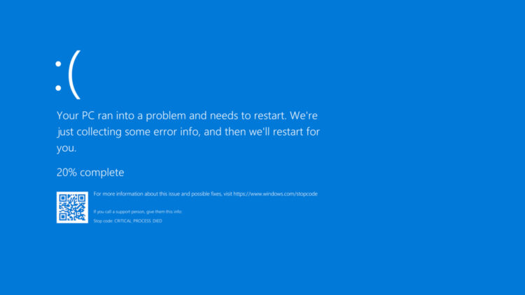
Microsoft has confirmed that the blue screen that has appeared so many times in our lives is about to disappear. Yes, that unbearable blue screen that indicated something was wrong with your computer, and that if you didn’t want to lose everything, you’d better have a backup… After almost four decades of scares, the dreaded Blue Screen of Death (BSOD) will be replaced in the next Windows 11 update by a simpler and completely black version (oooh, let’s pretend we’re sad…).
This news marks the end of an era and the beginning of a new visual strategy for system errors. Why this change now?
The blue screen of death: a story with a foretold ending
Who hasn’t trembled when the famous blue screen of death appeared and literally shook? That feeling has repeated for generations for more than 40 years! It has been an integral part of the Microsoft ecosystem.
Seeing that blue background meant something serious had happened in the system: hardware failures, critical errors, driver problems, losing your cousin’s wedding photos and causing chaos at home (true story)… A cryptic code and a QR were the only clues to solve the problem. Though hated, the blue screen became a universal symbol of computer errors.
With the arrival of Windows 11, Microsoft has decided to close that chapter. The new interface for system errors will be black, minimalist and with less visual information. The change aligns, according to the company, with the design principles of the new operating system, prioritizing clarity and “enterprise readiness”.
A controversial decision: is the change better?
Microsoft claims that this new black screen improves readability and makes it easier to manage unexpected reboots (surely it doesn’t scare you like the blue one).
However, many users and technicians have expressed concern. The new design removes useful elements like the QR code, which offered quick access to error documentation.
In its place, only a generic message and the error code are shown. Is that really enough?
More aesthetics, less functionality
Visually, the new screen is less intimidating. But losing key functionalities can affect advanced users, support technicians and developers. The blue screen wasn’t pretty, but it was useful. And while black looks more modern, many consider it a purely aesthetic decision.
When will this change reach users?
Microsoft hasn’t specified the exact date, but the change is expected to arrive in the next major Windows 11 update, and that is scheduled for late 2025.
What does this mean for the future of Microsoft?
Microsoft seeks to project a more modern, clean image consistent with its new visual approach, but is also opting for a more limited interface. The problem is that, by removing useful information that appeared on the screen, it could worsen the experience for those who need quick solutions.
The end of an era
Failures that reminded us our operating systems are very complex, frustrating? Yes, but iconic.
Its disappearance leaves a symbolic void in the history of computing. And although its successor may be more elegant, many will see it as a loss of identity.
Microsoft marks a before and after. The blue screen of death was part of the universal language of tech errors, a villain we all hated (and that we’re definitely going to miss). Time will tell if black is the new blue, but now all that’s left is to say goodbye to one of Microsoft’s most iconic images, farewell, my friend!

