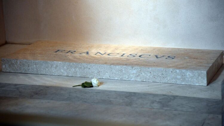
He asked for it himself: a simple headstone, with no decorations, no titles, just his name carved in white marble. “Franciscus”, nothing more. And yet, that gesture of humility from Pope Francis has ended up generating a controversy no one saw coming. The issue is not what the headstone says, but how it looks. More specifically, how the letters are spaced. A minimal typographic error that, because of the place it is in and the meaning it holds, has made headlines around the world. And really, it only takes a couple of seconds to notice that the inscription (carved in marble) shows irregular spacing between the letters, especially after the letters “F” and “R”.
Since it is carved in stone, any mistake becomes permanent. And in this case, the problem lies between the first letters of the name: the R, A and N are not well balanced, and that makes the word look strange. It’s not a spelling mistake. It’s not bad handwriting. It’s simply a spacing that breaks the visual harmony.
The death of Pope Francis
The passing of Pope Francis has deeply moved the world. Leader of millions of Christians, tireless defender of the most vulnerable, and symbol of humility in a Church that was growing distant from the reality of its faithful. His departure leaves a void impossible to fill, as we have seen in recent days. His tomb, which was meant to be a place of reflection and tribute, is now at the centre of an unexpected controversy.
An inscription that doesn’t convince the experts
Designers, architects and visual communication experts have raised their voices. As they explain, when letters are not correctly spaced, something known in design as kerning, the eye picks it up instantly, even if you know nothing about typography. In this case, the word “Franciscus” should have been optically adjusted so that it could be read smoothly, especially considering it is carved in marble and represents the life of someone so important within the Church.
Did no one check it?
Yes. Everything was approved by the Vatican. The content, the material, the style. Pope Francis himself gave his approval while still alive. But what many are pointing out now is that, beyond the symbolic, someone should have applied technical design criteria before engraving the final inscription. Could that be the simplicity Francis preached?
Is the Vatican going to change anything?
Despite the criticism, there don’t seem to be any plans for changes. The Holy See has made it clear that the design will remain as it is. For them, what matters is that the pope’s wishes are being respected. The content is clear, the message is coherent, and aesthetic reasons are not sufficient to alter a tomb with such symbolic value.
Pope Francis’s headstone was meant to be simple, to go unnoticed, just as he was in life, without luxury, like those who have the least. But because of a spacing error, it has ended up at the centre of attention. And even though it won’t be corrected, it has already left a mark.

